Choosing the right fonts for your website

You would not take a major online business magazine or a tech blog seriously if they opted to use Comic-Sans font. You will have trouble if the font choice was one of those extra-cursive ones or the ‘Old English’ font.

Fonts matter, and they are crucial in giving your websites a holistic look and feel. This might sound strange, but good font pairing runs parallel and in correlation with harmony, fluidity, and coherence to your website.

Too much of a good thing can be bad

Is the usage of a singular font throughout the entire website a good idea? Sometimes, yes. Websites require hierarchy to keep visitors engaged – this comes from lots of text and these work in cohesion provide subliminal ques to the visitors about a given brand’s look and feel.

When using multiple fonts, it is always important to choose fonts that go well with each other. Font pairing, while not a complex task, when added into the mixture of creating that all pleasing user interface, can become a bit tedious. This is because you are not just pairing fonts with each other but also marrying them with the design.

Two unmatching fonts making up lengthy posts unbearable to read. Users will not read the entire thing and skim through the important parts just so they can piece together what is written in it.

Remember that each additional font also costs you in page load times and performance. The more fonts you use, the slower your website becomes.

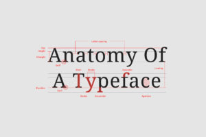
The technicality of legibility

Notice how literature and newspapers prefer serifs as their go to font and typefaces. This is because of the serifs (feet) at tops and bottoms of the characters, making them distinguishable such as the uppercase “I” and the lowercase “l”.

Pages with heavy text-based content usually would not be aesthetically bad with serif typefaces. But you do not have to walk away from experimenting with sans serif typefaces with distinct letterforms – that are without the serifs.

The importance of readability

San serifs were for quite long, thought to be the superior choice for online text than their serifs variants due to high readability. But this has since shifted in notion as studies do indicate towards little to no difference in the pace of people reading serif vs. san serif texts. With the improvement in screen resolutions, that will continue to improve more, typographers have moved towards creating font faces in both styles that are equally readable.

The comfort vs uniqueness conundrum

Sometimes you do not need to avoid typefaces like Roboto or Open Sans, because of their high frequency of usage. You must keep in mind that your website is for the readers. Depending on the content and purpose of your website, sometimes your font needs to be simple enough for your readers to not be distracted by them.

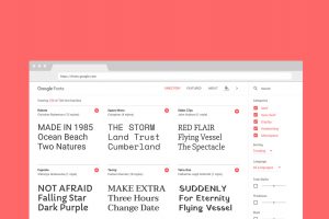
So how do I find good fonts?

Google Fonts is a library of 1023 free licensed font families. It offers an interactive web directory for browsing the library. The Google Fonts catalog is intended to enable font discovery and exploration, and the service is used extensively with over 41 trillion total font views. Popular fonts include Roboto, Open Sans, Lato, Oswald, Montserrat, Source Sans Pro, and Raleway.

When choosing fonts for the web, it is a good idea to choose one from Googles library of fonts. It n ot only offers you a host of open sourced fonts, but also ensures that the fonts are well optimized for the web.

Designers understand how to pair fonts and typefaces as well which fonts will be pleasing and relaxing for the viewer to experience and which would not. When choosing fonts, it is always a good idea to listen to their advice.